
How-to: Make Your Story Page Interesting — Part 2: Cover Art · 6:43pm May 18th, 2014

Welcome back! Thanks for still sticking around with me. In the previous blog we talked about story titles and some tips to keep in mind when choosing one. Now comes the greatest part of your story (literally; there is a good chance that picture you’re using as cover art takes up a huge multiple of the space that the bytes of your combined words make).
Let’s begin!
Not everyone always looks at the story title first, as I mentioned last time. Some people prefer to scan for interesting images before they even take another glance. Usually though, cover images go hand-in-hand with all the other parts of a story page, and in many cases it wouldn’t be clear from just looking at one part what the story is about.
Apart from adding pictures to your actual story within the chapters (something you should never do unless it’s some sort of bonus, like chapter-specific fan art), the cover art is your only chance to get some color into your story. So please, for the love of everything you hold dear:
Take that chance!
Sinner number one and death cause of almost everything I see when I browse through story lists is having no cover art. Guys, don’t do that. Even the plainest and most boring picture will still add more than absolutely nothing.
To prove that statement I will give an example of a story that has the plainest cover image I’ve ever seen, yet it’s still awesome what kinds of feelings it evokes in you:
Gloomy Everyday by the parasprite

This is just a grey picture. You can find stock things like these in five seconds on Google, and yet it adds so much to the story.
Another example is from a rather new story:
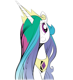
Today is a Good Day to Die by Aragón
I’ll let my ego hang out here for a second and say I was the one who picked that picture. In comparison to the weird-funny-dark thing story title, Celestia with a cute smile just immediately provokes some sort of curious confusion in the reader, and they might be interested in taking a closer look.
So you see plainness is still extremely helpful and always better than nothing.
However, do not see this as reason to go too hard. If you have a cover image that’s just an overload of informations it becomes the same deal all over again that we had with the title: less is more. If you have a cover image that is so filled with stuff that you need to click on the full size image to actually see everything, you have a great problem. Too much information just turns people away, and since you have way more pixels available in that small image than words in a good description you can also much more easily mess exactly that up.
If you ever went to a library and strolled through the criminal novels section you could’ve spotted a lot of interesting books. If you think back hard enough you will notice the images too are very straight-forward in the sense of information they share.
There really is only one thing you should never do. Ever.
OC Maker images or recolors.
I mean, I kind of expect most writers to be aware of this simple rule, but it can’t harm to add it here. There is nothing worse than having a story with one of these, and this is the only time I’m going to say that nothing a cover art at all is a better idea.
Of course, the deal with OCs is a whole other story and certainly nothing for me go comment on, but this is just something that needs to be mentioned.
So, with all that said, just one last advice on the technical aspects: If you can help it, try to keep the aspect ratio so that the image is wider than taller. The common person would say this is crap, rightfully, because all regular books in the world have a tall cover image. The difference here is that FIMFiction isn’t a real bookstore, thus you ought to work your way around the website’s design. On story pages all images have a horizontal size limit, but not a vertical one. It’s just really annoying and confusing to have an image that is as big as the entire description box.
The last thing to point out is something about time. In other words, the creation process of a story could always vary from case to case. Sometimes you start with an idea and write in an untitled document, sometimes you find an amazing image that you use for inspiration.
Both things are perfectly fine, but the former one comes with a problem. If you have a very exotic idea, chances for you to find a fitting image are very slim. The most you could do is browse through Derpibooru and find something that is at least somewhat fitting.
Trick to remember: When in doubt, just get a plain vector image of the main characters.
Once again I’m surprised how much I could ramble about this. And the best part is that I could go on and on. There are so much things one can say about cover arts, because no matter what you do, somehow something will always be imperfect. These are by far the hardest things to get right on a story page, and might as well take as long as the story itself to create.
The good news is that the cover art isn’t the most important part to get a story interesting, we’ll focus on that in the future.
Next up is tags.
Stay tunad!
I actually don't mind the OC images as much, as long its good OC.
Putting an OC as a pic gives the OC haters the info they need to stay away, and not read the description of your ultra awesome red alicorn/changeling hybrid OC.
Otherwise it not that bad.
Just put a picture that gives reader a idea what the story is somewhat about (usually picture of main character(s) suffices).
I tend to judge the book by the description tho.