King Sombra Fan Fiction
1,701 members · 1,390 stories
Join our SubscribeStar to remove these adverts!
Stats
Page generated in 0.024 seconds
Total duration
833 users online
37,576 hits today, 1,695,604 yesterday
FIMFiction
My Little Pony: Friendship is Magic Fanfiction
Designed and coded by knighty & Xaquseg - © 2011-2024
Follow & Support Us
![]() Support us
Support us
SubStar
![]() Chat!
Chat!
Discord
Follow us
Twitter
MLP: Friendship is Magic® - © 2024 Hasbro Inc.®
Fimfiction is in no way affiliated with or endorsed by Hasbro Inc.®
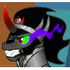
Howdy folks, a long time ago I tried my hand at writing a 'Sombra comes back as a pissed-off spirit of vengence and destroys everything in his path' sort of fic. Though at a few chapters, it has become derelict from many many months ago and disappeared into the recesses of my unpublished fics folder.
However, I still was subjective on what art version I should use for the cover image when (if) I do publish it one day. The images are actually of the same one I drew, but were styled differently for the final outcome.
So if I can have some opinions on what you all think about these covers that would be greatly appreciated.
Version 1

Version 2

version 2
Version 1 is ohhhhhhhh.
Vewrsion 2 is "What the fuck am i smoking?!"
Megatron out.
2127273 Version 2.
the first version
2127273 Version 3, AKA. I can't decide either.
2127273 first one
2127273
Version 1
2127273 Definitely Version 1. It's more ominous and spooky, and def has a more scary vibe to it. version 2 has a lot more white than black, making it a lot brighter and removing that foggy unknown element that version 1 has. the eyes and horn pop out more, but I feel like they call too much attention to themselves. V1 I was drawn more to his mouth and general face area. V2 just his eyes and horn, I couldn't 'see' his whole face.
Version one is a lot darker, more mysterious and more sinister, and I feel it fits King Sombra's dark persona perfectly. I feel that version two is just too bright, and doesn't really convey Sombra as a character as well as the other version.
I hope this helps.
Definitely the first one. Much more atmospheric and dark.
Version 1